Building a Book Launch Site That Actually Respects Its Users
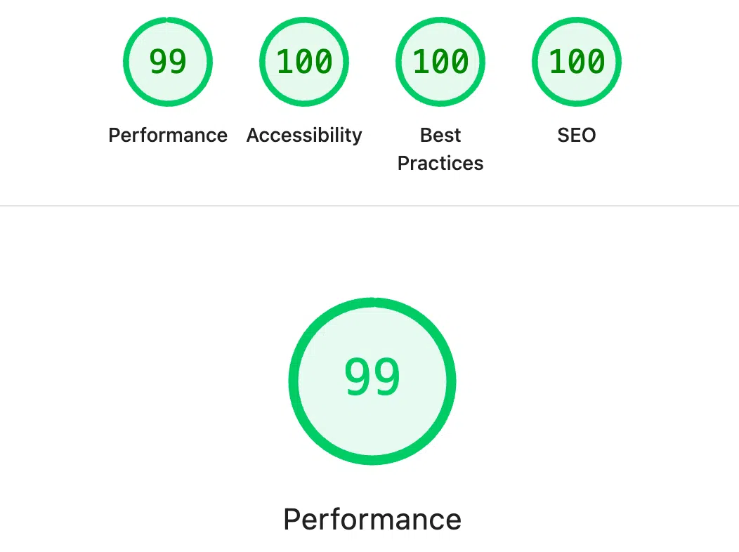
How we achieved 99/100/100/100 Lighthouse scores (Performance, Accessibility, Best Practices, SEO) while building a bilingual, dark-mode-enabled book launch site with Astro.js. No compromises on user experience.

Reading Mode
Font Size
Line Spacing
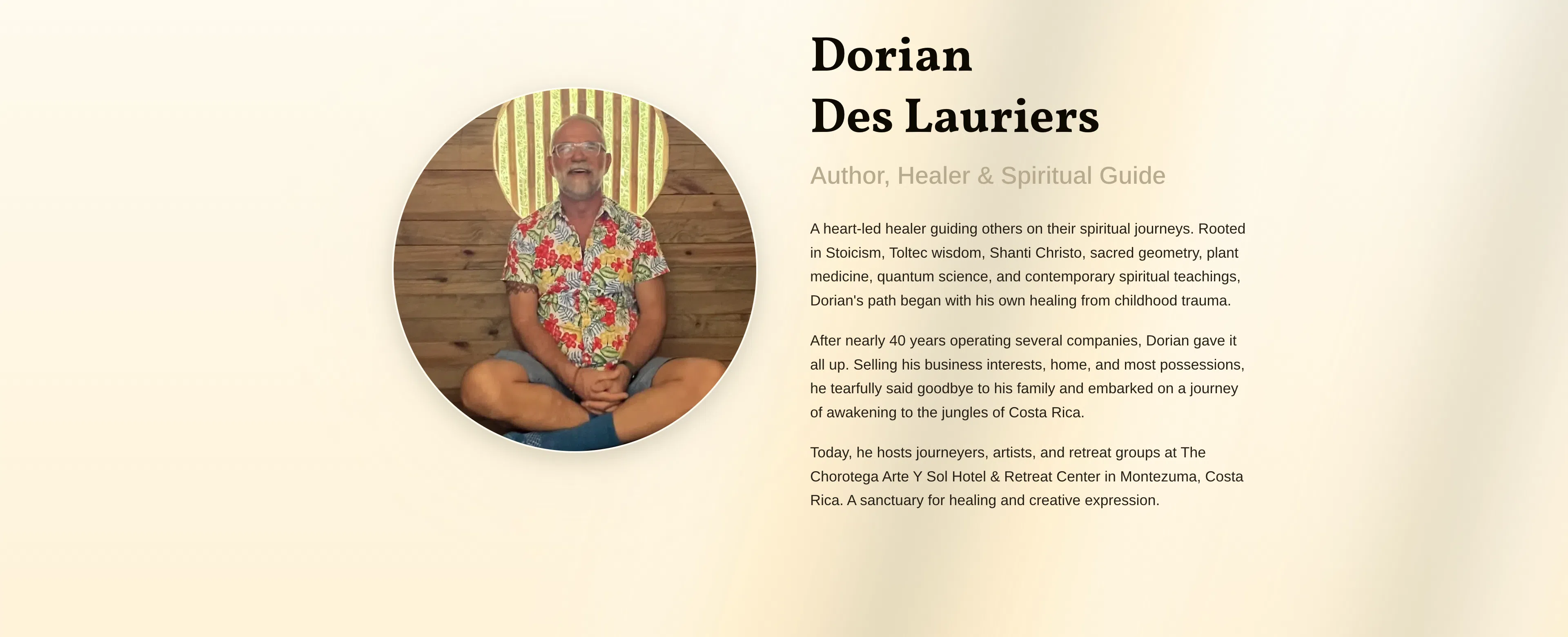
Dorian Des Lauriers is writing a book about his journey from corporate life to spiritual awakening in the Costa Rican jungle. When he asked me to build the launch site, I had one requirement: it needed to work perfectly for everyone. Not “good enough for most people.” Everyone.
That meant keyboard users, screen reader users, people on slow connections, Spanish speakers, and anyone who prefers dark mode. No compromises.
We ended up with 99/100/100/100 Lighthouse scores—99 on Performance, perfect 100s on Accessibility, Best Practices, and SEO. Here’s what that actually means.
Why This Project Mattered
This isn’t just another landing page. Dorian’s book is about spiritual transformation—about healing trauma, finding purpose, and awakening to life. The website couldn’t just look good. It needed to embody those same values: inclusive, accessible, welcoming.
If someone can’t use your site because they navigate with a keyboard, or because they’re using a screen reader, or because you didn’t bother translating it into their language—you’re not being inclusive. You’re just leaving people out.
The Design: Light, Dark, and Everything Between
The site needed to feel grounded and spiritual without being cheesy. Warm colors. Clean typography. And an animated background that I’m genuinely proud of.
I built animated “light rays” that slowly move across the page—like sunlight breaking through trees. Two layers at different speeds, subtle enough that you might not consciously notice them, but they create this sense of movement and calm.
The challenge was making it work in both light and dark mode without feeling jarring. In light mode, warm beiges and golds. In dark mode, deep browns and muted tones. Same animation, different palette.

Accessibility: From Good to Perfect
My initial build scored 96/100 on Lighthouse Accessibility. That’s good by most standards. But 96 isn’t 100, and I wanted to know why.
The Keyboard Navigation Thing
Every element on the site is keyboard accessible. Tab through everything. Escape closes modals. Enter activates buttons. When you open a modal, focus jumps to the first input field. When you close it, focus returns to where you were.
This isn’t magic—it’s just respecting how people actually use the web.
There’s also a “Skip to Content” link that appears when you press Tab. It’s hidden by default, but if you’re navigating with a keyboard, it lets you skip all the navigation and jump straight to the content. Required for perfect accessibility scores. Essential for users who actually need it.
The ARIA Label Mistake
Here’s what tripped me up initially: I was adding aria-label attributes to buttons that already had visible text.
Lighthouse failed me on two audits:
- “Links do not have a discernible name”
- “Elements with visible text do not match accessible names”
The fix? Stop overthinking it. If a button says “Notify Me at Launch,” that’s already the accessible name. Adding an aria-label that says something different just confuses screen readers.
Visible text = accessible name. That’s it.
Form Fields Done Right
Every form field got proper labels, autocomplete attributes, and aria-required tags. When someone makes a mistake, the error messages are clear and in their language (English or Spanish).
Small details that compound into a great experience.
Bilingual: Both Languages, Not Just UI
I’ve written before about why proper translation matters. This project reinforced all of it.
The site isn’t just “available in Spanish.” It’s built in Spanish. Every string, every button label, every error message, every accessibility attribute—fully translatable from day one.
The Spanish version scored 100/100 on SEO, just like English. That doesn’t happen by accident.
Mobile: Not an Afterthought
The mobile experience got just as much attention as desktop. The nav collapses into a bottom drawer (easier to reach with your thumb). Theme toggle is right there. Everything scales properly.
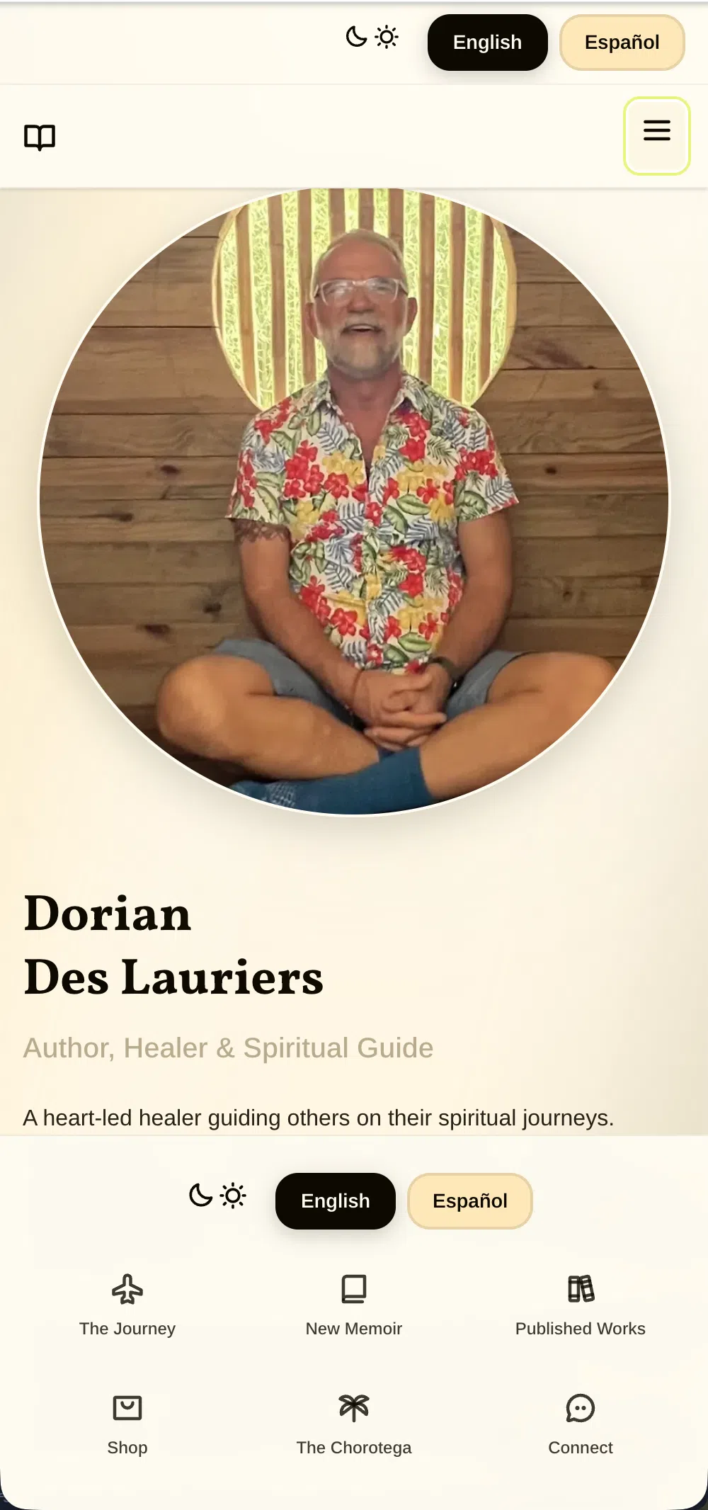
The signup flow works perfectly on a phone. The confetti celebration when someone joins? Just as dramatic on mobile as desktop. Because why not.
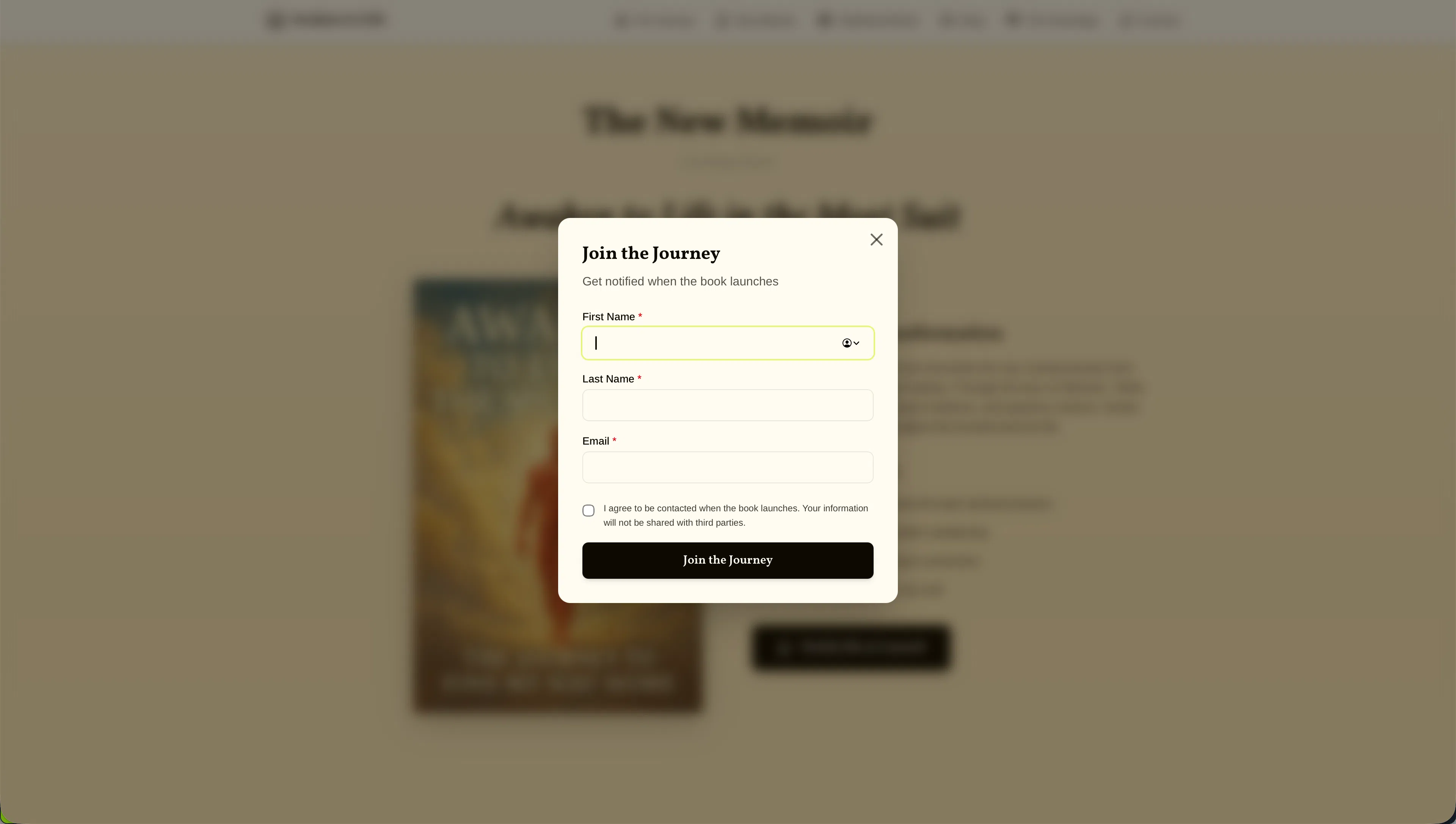
The Signup Celebration
When someone signs up, they’re not just submitting a form—they’re joining a journey. The experience needed to reflect that.
Standard toast notification in the top-right corner? Boring.
What I built: A big, centered success message with 100 pieces of confetti falling from the top. Four seconds of celebration. Because joining a spiritual awakening journey should feel significant.
It’s extra. It’s probably overkill. But it makes people smile, and that matters.
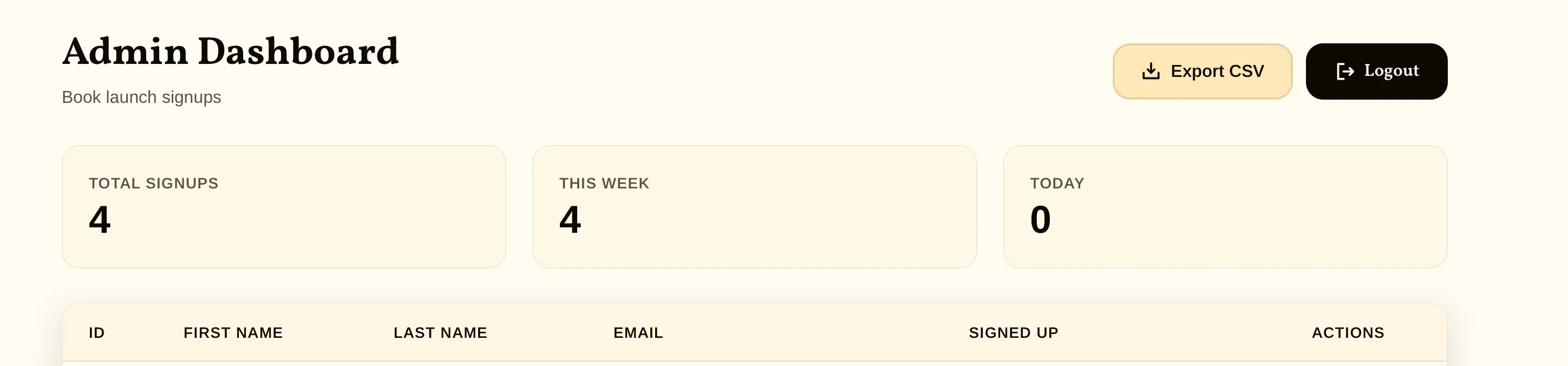
The Admin Dashboard Nobody Sees (But Should Know About)
While we’re celebrating signups on the frontend, Dorian needs to actually track who’s signing up. So I built a clean admin dashboard.
What it does:
- Real-time stats: total signups, this week’s signups, today’s signups
- Complete signup list with names, emails, and timestamps
- CSV export with a single click (downloads as
signups-YYYY-MM-DD.csv) - Individual signup deletion if needed
- Auto-refreshes every 30 seconds
- Session-based authentication
The data lives in a SQLite database with proper indexes for performance. Simple, fast, and maintainable.
It’s not public-facing, but it’s built with the same care as everything else. Because tools you use every day should work well.
SEO: 100/100 in Both Languages
Perfect SEO scores required being intentional about everything:
Meta titles that include keywords people actually search for:
“Awaken to Life in the Meat Suit | Spiritual Awakening Memoir by Dorian Des Lauriers”
Meta descriptions under 160 characters that actually compel clicks, not just keyword stuffing.
Structured data (JSON-LD) telling Google exactly what this site is about—a book, by this author, with this description.
hreflang tags telling Google about the language versions so they show up correctly in search results.
Alt text on every image that’s descriptive, not decorative.
All of this together? 100/100 on SEO for both English and Spanish.
The Security Fix I Almost Missed
I initially tried setting security headers via meta tags:
<meta http-equiv="X-Frame-Options" content="DENY" />The browser console literally told me: “This doesn’t work here.”
X-Frame-Options can only be set via HTTP headers, not meta tags. So I wrote middleware to set proper security headers on every response. No console warnings. Clean.
Small detail, but it matters.
Performance: Getting Close to Perfect
The site loads fast. Images are optimized to WebP/AVIF, everything below the fold lazy loads, CSS is minified, and there’s zero layout shift.
Current production score: 99/100. Fast enough that it feels instant.
What would push it to 100?
Lighthouse showed me exactly what’s left:
- Preconnect to
fonts.gstatic.com(saves ~90ms on LCP) - Add
fetchpriority="high"to the hero image - Increase image compression slightly (could save ~36KB)
- Inline critical CSS instead of linking it
All optimizations that matter more for benchmarks than user experience. The site is already fast. But for the next iteration? We’ll hit that perfect 100.
The Stack (For Those Who Care)
Built with Astro.js, Tailwind CSS 4, TypeScript, and Bun. SQLite database for signups. Deployed via Docker to Coolify.
I chose Astro because it ships zero JavaScript by default unless you need it. Perfect for a content site that needs to load instantly.
Tailwind 4’s CSS-first approach made the theme system clean. Every color defined once, used everywhere, switches perfectly between light and dark.
The Numbers
Production Lighthouse Scores:
- Performance: 99/100 ⚡
- Accessibility: 100/100 ✅
- Best Practices: 100/100 ✅
- SEO: 100/100 ✅
Nearly perfect across the board. 99 on performance with clear optimizations identified to hit that final point.
Both English and Spanish versions hit these scores consistently. Performance is fast enough that users don’t notice any difference—and we know exactly what to tweak to hit that perfect 100 on the next iteration.
What I Learned (Again)
Accessibility Is a Design Constraint, Not a Feature
You can’t “add accessibility later.” It has to be baked into every decision from the start. How do modals work? What happens when someone presses Escape? Where does focus go?
These aren’t edge cases. They’re how millions of people use the web.
Dark Mode Is a Design System
You can’t just invert colors and ship it. Every element—text, backgrounds, shadows, animations—needs consideration in both themes. It’s not twice the work, but it’s definitely more than “set a dark background.”
Bilingual From Day One Is Easier
Building translation in from the start is way easier than retrofitting it later. Every component I wrote assumed multiple languages. Never hardcoded text. Clean, maintainable, scalable.
Lighthouse Will Humble You
96/100 feels great until you realize it’s not 100/100. Those last 4 points? They taught me more than the first 96.
The Details Compound
Proper autocomplete attributes. Focus return after modal close. Escape key handlers. Smooth theme transitions. Celebratory confetti.
None of these were “required.” All of them matter.
Final Thoughts
This project reminded me why I care about this work. It’s not just about making things look good (though that helps). It’s about creating experiences that work for everyone—keyboard users, screen reader users, Spanish speakers, people with slow connections.
Dorian’s book is about awakening to life. The site needed to be awake too—accessible, inclusive, welcoming, and technically sound.
Perfect accessibility and SEO scores aren’t just numbers. They’re a commitment to respecting everyone who visits your site.
A Living Project
This isn’t a “set it and forget it” website. As Dorian gets closer to the book launch, we’ll continue refining both the main site and the shop. New features will be added. Content will evolve. The design will adapt to what the audience needs.
The foundation is solid, but the project is very much alive and growing alongside Dorian’s journey.
Check it out:
awakentolifeinthemeatsuit.com
Want something similar?
Get in touch
Written while listening to ambient music and drinking too much Costa Rican coffee. The good kind.
Liked this?
Let's build yours
This is how we think about every build. Tell us about yours: a free consultation, a real human, no pressure.