Why I Spent 18 Hours on a 'Simple' Translation Project
The Chorotega Hotel needed their website in Spanish. I could have used a plugin and been done in an afternoon. Here's why I didn't, and what that decision means for their business.

Reading Mode
Font Size
Line Spacing
“We need the site in Spanish.”
Five words that could mean a quick afternoon with a translation plugin, or two days of methodical work building proper infrastructure. I chose the latter, and not because I enjoy taking the long road.
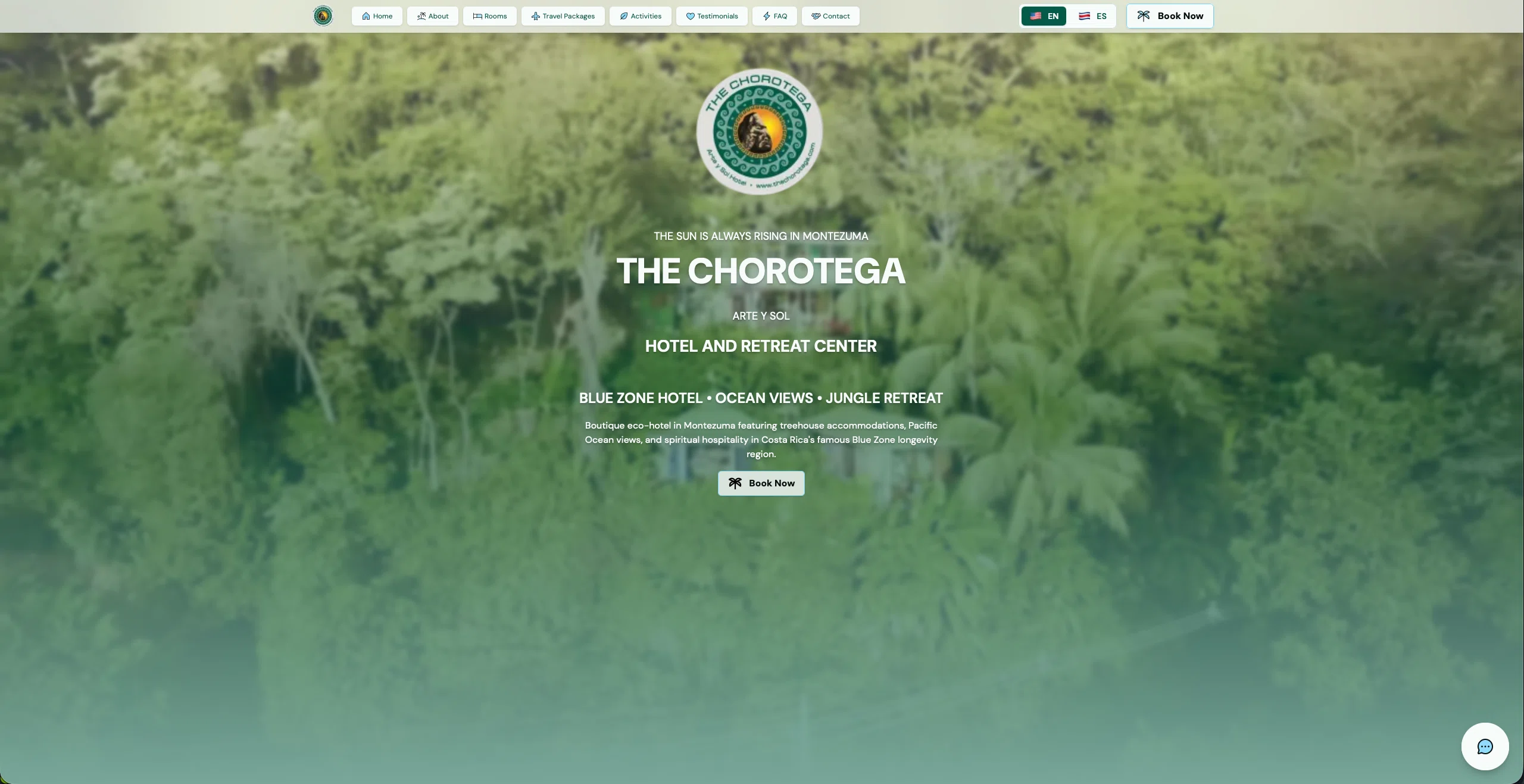
The Chorotega Hotel is a spiritual hospitality retreat in Montezuma, Costa Rica’s Blue Zone. Their website serves two distinct audiences: English-speaking tourists booking rooms from abroad, and Spanish-speaking staff and local partners managing operations. A half-baked translation would serve neither group well.
This is the story of why proper internationalization matters, what it actually takes to do it right, and the business value that comes from not taking shortcuts.
The Problem: More Than Just Words
When clients ask for translation, they’re usually thinking about the visible text—buttons, headings, descriptions. But a bilingual website is a much deeper challenge:
- 19 components across 3 main pages
- 10 detailed room descriptions
- 8 FAQ answers about local geography
- Form validation messages that fire in JavaScript
- SEO metadata and structured data
- URL structures that need to work in both languages
- A design system that had grown organically without standards
I could see two paths forward. The fast one: install a plugin, run the content through a translation tool, call it done. The right one: build proper infrastructure that would serve the business for years.
The fast path would take an afternoon. The right path would take 18 hours of focused work.
Why Shortcuts Compound
I’ve taken shortcuts before. We all have. And I’ve learned that every shortcut you take today is a problem you inherit tomorrow.
A translation plugin might work fine initially, but what happens when:
- You need to update a translation and don’t remember how the plugin works?
- The plugin updates and breaks your build?
- You need to add a third language?
- Your client-side JavaScript needs translated strings?
Each of these becomes a puzzle to solve later, usually when you’re under pressure and don’t have time to think clearly.
The alternative is infrastructure: a system that’s transparent, maintainable, and predictable.
Building the Foundation
I chose Astro’s native i18n approach over third-party libraries for three reasons:
File-based routing. Every language gets its own route (/ for English, /es/ for Spanish). Clean URLs that work great for SEO, no middleware complexity.


Type safety. Using TypeScript with a centralized translation file means autocomplete for every key. If I typo something, my editor catches it before the build even runs.
It scales. Whether The Chorotega adds Portuguese next year or sticks with two languages forever, the architecture supports it without a refactor.
The structure is straightforward:
// src/i18n/ui.ts
export const ui = {
  en: {
    'nav.home': 'Home',
    'nav.about': 'About',
    // ... 290+ keys
  },
  es: {
    'nav.home': 'Inicio',
    'nav.about': 'Sobre Nosotros',
    // ... 290+ keys
  },
} as const;
No magic. No runtime surprises. Just a system that’s easy to understand six months from now.
The Translation Work
290+ translation keys across the entire site. Room descriptions that needed to maintain the warm, spiritual brand voice in both languages. FAQ answers explaining Costa Rican geography. Form validation messages. SEO metadata. Schema.org structured data for search engines.
Each translation had to feel natural in Spanish while preserving the meaning and tone. “Spiritual hospitality” and “Blue Zone living” aren’t phrases you can just run through a translator and call it done.
One decision I made early: testimonial quotes stay in English. They’re authentic guest reviews, and translating them would feel disingenuous. Everything else got the full bilingual treatment.
Solving the Client-Side Challenge
The trickiest part was form validation. Most content renders at build time in a static site, but validation messages fire in the browser via JavaScript. How do you make those language-aware without loading translation files at runtime?
The solution: pass translations as data attributes on the form element.
<form data-validation-required={t('contact.validation.required')}
      data-validation-email={t('contact.validation.invalidEmail')}>
  <!-- form fields -->
</form>

<script>
  const form = document.querySelector('form');
  const messages = {
    required: form.dataset.validationRequired,
    invalidEmail: form.dataset.validationEmail
  };
  // Use messages in validation logic
</script>
The browser gets the translated strings at build time. JavaScript uses them at runtime. Problem solved, no complexity.
Fixing What Was Already There
With translations complete, I stepped back and saw what I’d been ignoring for weeks: inconsistency. Cards with different padding. Borders that varied. Heading levels that didn’t make semantic sense.
If I was already touching every component for translations, why not establish real standards?
I created a design specification document that cataloged every color, font size, component pattern, and animation. It revealed:
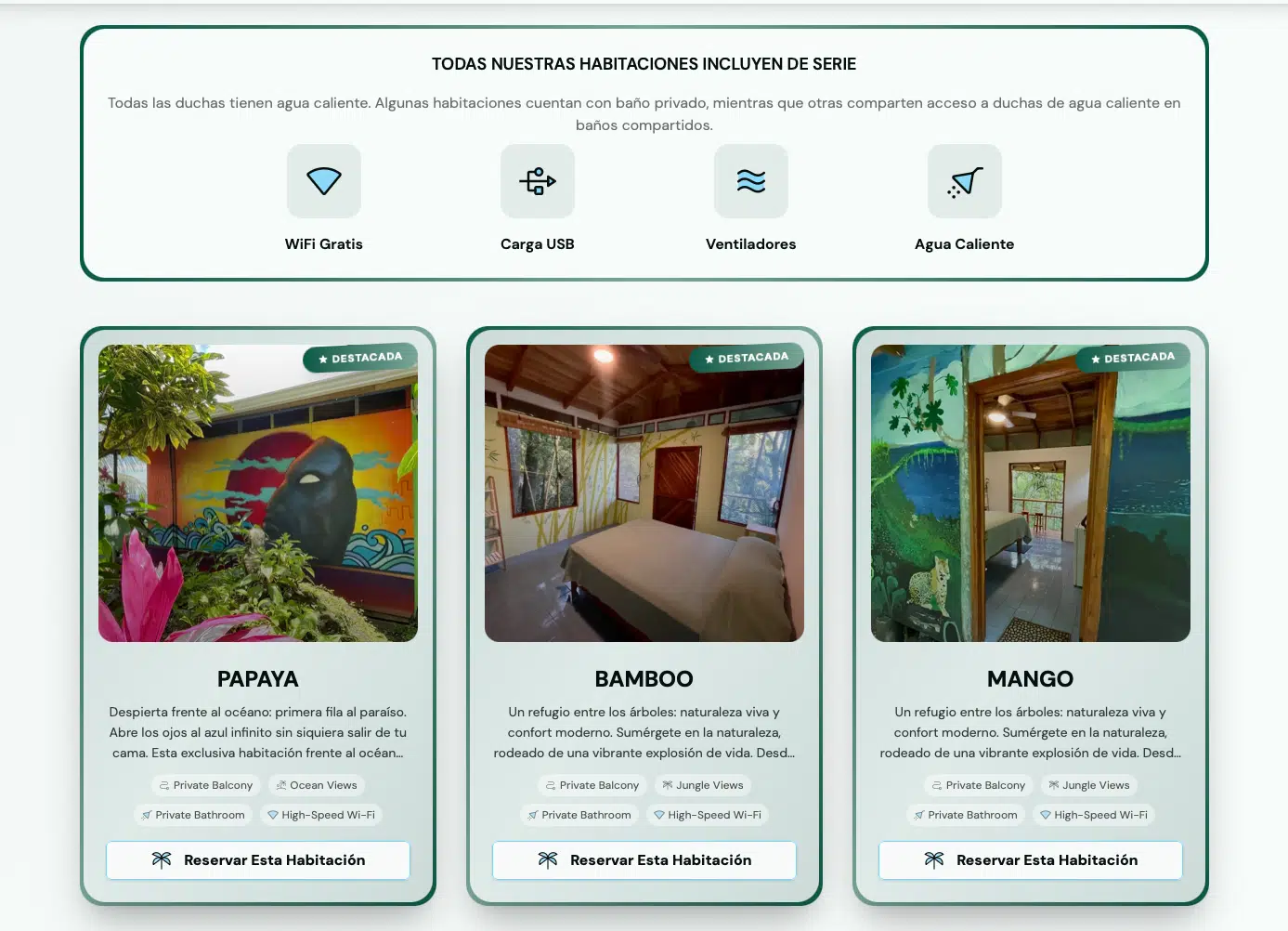
- 8 different card types with inconsistent padding
- Mixed background colors (bg-white/60, bg-white/70, bg-white/80)
- Typography hierarchy that could be cleaner
Then I applied standards across the entire site:
- All cards: consistent
p-4padding - All borders:
border-0for a clean, modern look - All containers:
max-w-8xlfor breathing room - All heading levels: better semantic hierarchy
- All backgrounds: unified to
bg-background/60
Every component updated. Perfect consistency.
The Details Compound
A 2px difference in padding doesn’t seem like much until you have 50 cards across 8 sections, all with slightly different spacing. Then it feels chaotic.
The room gallery modal was a good example. Thumbnails were overlapping, the modal felt cramped, navigation arrows were hard to see. A few focused improvements made all the difference:
- Horizontal scrolling thumbnails with no overlap
- Modal sized at 90vw on desktop for a generous viewing area
- Larger arrow buttons with clear hover states
- Active thumbnail highlighting
- Amenity previews on room cards
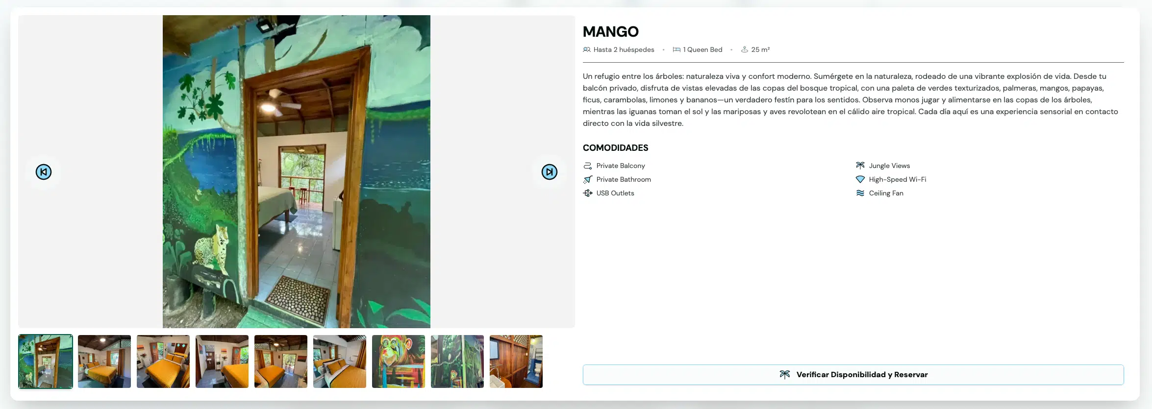
Small changes. Big impact on the user experience.
The client also wanted featured rooms to “really pop.” Rather than just making the badge bigger, I added gradient borders with subtle pulse animations, enhanced badges with icons, and brighter backgrounds. Now when you scroll through the rooms, the featured ones—Papaya, Bamboo, and Mango—demand your attention.
Why Documentation Matters
I maintained detailed documentation throughout this project. Not because I enjoy writing specifications, but because six months from now when I need to add a new section or update a translation, I won’t be guessing.
Every decision is recorded. Every pattern is documented. Every standard is explained.
That’s not busywork. That’s insurance against future chaos.
What This Actually Taught Me
Standards aren’t constraints; they’re freedom. Once I established the card styling standard, I stopped thinking about those decisions. I just applied the pattern. That freed up mental energy for problems that actually required creativity.
Documentation is a conversation with future-you. Every time I write something down, I’m helping the version of me who has to maintain this code in six months. That guy always appreciates the effort.
Consistency compounds. Each small inconsistency creates cognitive load. Multiply that by dozens of components and hundreds of elements, and you’ve created a subtly chaotic experience. Clean it up, and everything just feels better.
The journey teaches more than the destination. I could have used an AI agent to bash out these changes in a fraction of the time. But I wouldn’t have internalized the patterns. I wouldn’t have developed opinions about what works. I wouldn’t have built the muscle memory that makes the next project easier.
The Technical Stack
For the developers reading this:
Core Framework:
- Astro 5.14.4 with native i18n
- TypeScript for type-safe translations
- Tailwind CSS for styling
- File-based routing for language variants
Type Safety:
export const ui = { /* ... */ } as const;
export type TranslationKey = keyof typeof ui['en'];
Every t('some.key') is type-checked. Refactoring is safe. Autocomplete works everywhere.
SEO Implementation:
hreflangtags for language variants- Translated meta tags and descriptions
og:localeandog:locale:alternatefor social sharing- Schema.org structured data in both languages
The site doesn’t just work in two languages; it’s optimized for discovery in both languages.
The Business Value
This wasn’t just a technical exercise. The Chorotega Hotel serves a bilingual market—English-speaking tourists booking rooms from abroad, and Spanish-speaking staff and local partners managing operations.
A quick translation plugin would have given them words in two languages. But it wouldn’t have given them a maintainable system. Now when they need to add a new room description or update pricing information, it’s straightforward. The structure supports the business, not the other way around.
That’s the real value: infrastructure that doesn’t just work today, but will still make sense a year from now when someone needs to make changes.
Reflections
“How you do anything is how you do everything.”
I could have rushed through the translations. I could have skipped the UX improvements. I could have ignored the inconsistencies. But each of those shortcuts would have been a small compromise, and small compromises add up.
Instead, I took the time to build proper infrastructure, document decisions, apply standards consistently, and iterate on the details. The result is a codebase that I’m proud of and that will serve The Chorotega well into the future.
Is that worth 18 hours instead of an afternoon? For me, yes. Because the value isn’t just in what I delivered—it’s in what I learned, in the standards I established, and in the confidence that this system will be maintainable six months from now.
The Takeaway
If you’re facing a similar project—whether it’s i18n, a major refactor, or something else entirely—here’s what I’d recommend:
Understand what you have before you change it. Take inventory. You can’t improve what you don’t understand.
Build infrastructure, don’t hack around problems. The shortcuts you take today become the problems you inherit tomorrow.
Establish standards and apply them consistently. Once you have a pattern, stop thinking about those decisions and focus on problems that actually require creativity.
Document for future-you. Six months from now, you’ll be grateful.
This project reminded me why I do this work. It’s not about churning out features or hitting deadlines. It’s about the craft of building something well—something that serves its purpose, maintains its standards, and will still make sense when you come back to it later.
That’s the kind of work that feels worth doing.
If you’re ever in Montezuma, Costa Rica, check out The Chorotega Hotel. And if you’re working on a bilingual site, I hope this gave you some ideas.
Thanks for reading.
Links:
- The Chorotega Hotel: thechorotega.com
- Astro i18n Recipe: docs.astro.build/en/recipes/i18n
Liked this?
Let's build yours
This is how we think about every build. Tell us about yours: a free consultation, a real human, no pressure.