Learning Shopify: 8 Hours of Liquid Templates and E-commerce Development
My journey learning Shopify development by building a custom theme from scratch instead of using embedded widgets, and what I discovered about handling complex Printful variants, bilingual content, and brand consistency.

Reading Mode
Font Size
Line Spacing
I built Dorian a website a few weeks ago. Clean, accessible, bilingual, three perfect Lighthouse scores. Wrote about that journey too. Thought we were done.
Then he asked if people could buy merch.
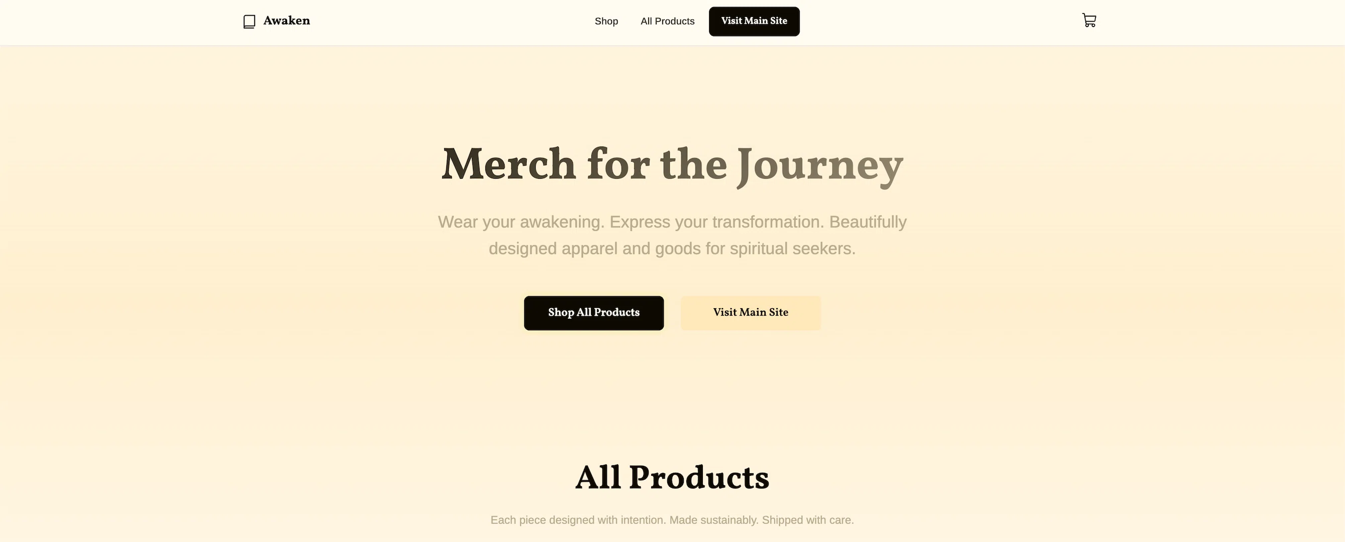
Not just a link to Shopify. He wanted something that felt like the main site. Something warm. Something intentional. Something that wouldn’t look like every other print-on-demand store.
I had never built a Shopify theme before. This seemed like a good opportunity to learn.
The Learning Opportunity
Here’s what I could have done: embed a Shopify Buy Button on the Astro site. Maybe add a dedicated page with their default product widgets. Done in an afternoon.
Here’s what I wanted to do: learn how Shopify themes actually work. Understand the platform. See what’s possible.
The main site had a specific feel. Warm colors. Thoughtful typography. Animated background rays. Dark mode that actually worked. Navigation that made sense. Everything bilingual from the ground up.
If the shop looked generic, it would undermine everything else.
So instead of embedding Shopify into the Astro site, I decided to build a completely separate Shopify theme that matched the main site’s design system.
Different approach. Different challenges. New things to learn.
Why I Chose to Learn Full Theme Development
Most developers would tell you embedded widgets are easier. They’re not wrong.
But here’s what I wanted to understand:
How does Shopify’s checkout experience actually work? What’s possible with product page customization? How does Shopify’s CDN performance compare? What does proper cart management look like? How do you build something that can grow?
What you gain with widgets is speed. What you learn with a full theme is everything else.
Dorian’s not running a generic t-shirt store. This is an extension of his brand. His spiritual journey. His writing. The merch exists to support that story, not replace it.
I wanted to understand how to tell that story properly in Shopify.
Starting from Dawn, Learning the Structure
I used Shopify’s Dawn theme as a foundation. Not because it’s perfect, but because it’s well-structured and maintained by people who understand e-commerce better than I do.
Then I started learning what each piece did and how to modify it.
The color palette came directly from the main site:
- Warm off-white background (
#fefbf1) - Deep brown text (
#0e0a01) - Beige highlights (
#fee8b9) - Yellow-green accents (
#e9f57a) - Muted brown borders (
#b8ab8e)
Same fonts:
- Vollkorn for headings
- Arimo for body text
Same animated background with the god rays effect.
Same button styles—dark backgrounds with yellow-green hover states.
The goal wasn’t to copy the main site exactly. It was to learn how to make both sites feel like they came from the same place. To understand what makes design feel intentional.
The Sections I Had to Learn
Shopify 2.0 is built around sections. Reusable, customizable blocks that merchants can add, remove, and rearrange.
I had to figure out how to build these:
Hero Section
First thing visitors see. Simple message: “Merch for the Journey.” Gradient overlays. Fade-in animations. CTA buttons that feel substantial but not aggressive.
All Products Grid
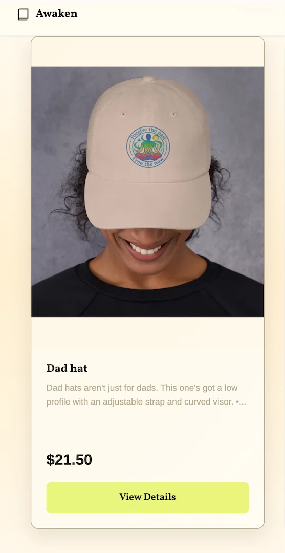
Shows everything. Product cards with hover effects—subtle lift, gradient overlays, image zoom. Nothing jarring. Just enough to feel interactive.
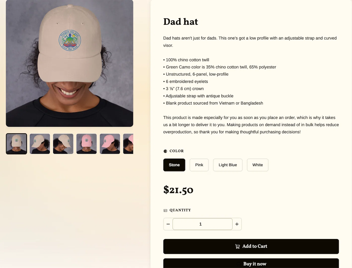
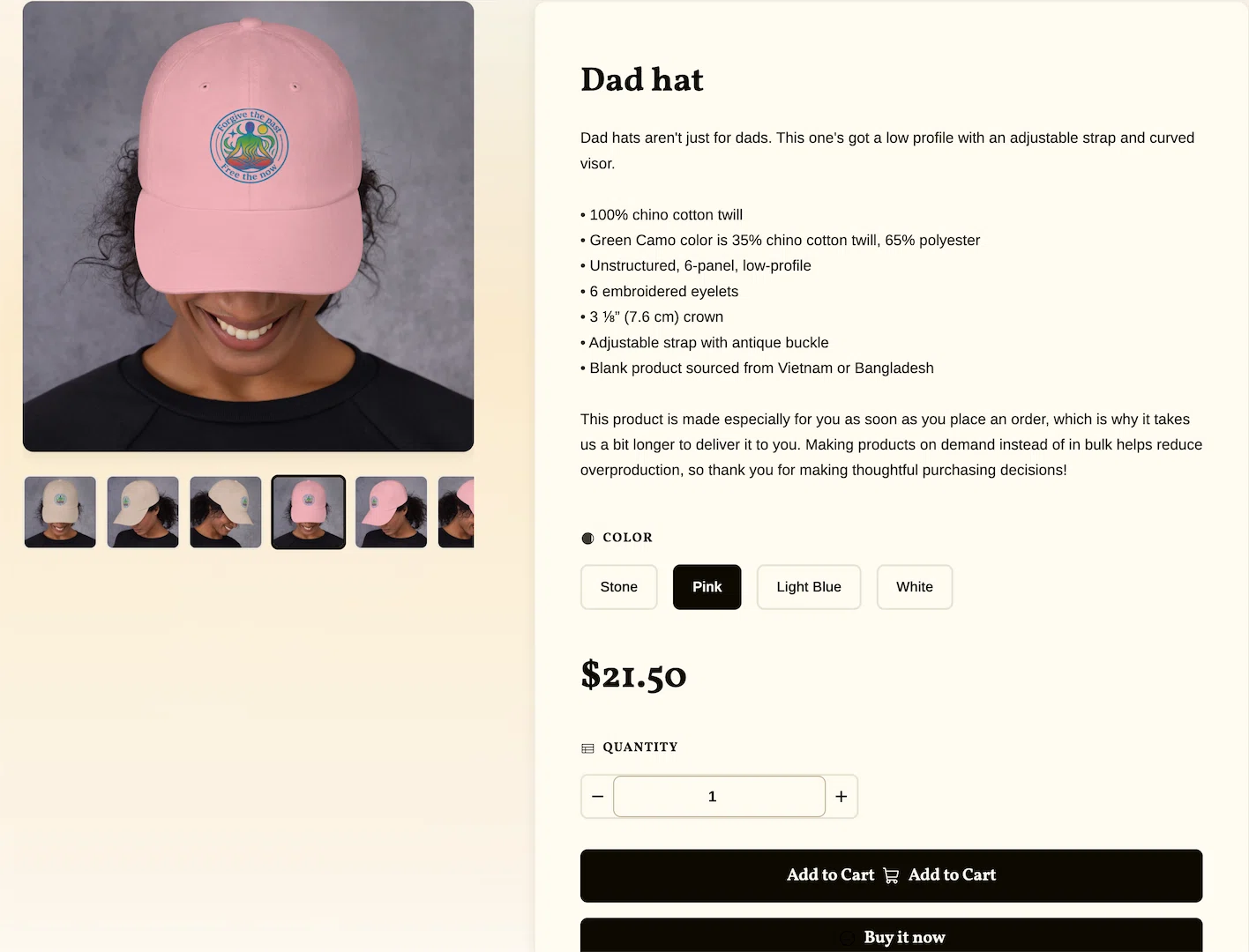
Product Pages
This is where print-on-demand gets complicated. Multiple colors. Multiple sizes. Different prices per size. Images need to switch when you select a color. Prices need to update when you select a size.
I spent most of my time here learning how variant selection actually works. Getting this right matters more than anything else because this is where customers make decisions.
Cart Drawer
Slides in from the right. Shows what you’ve added. Lets you adjust quantities. Proceeds to checkout. No page reloads. Just clean, modern AJAX cart functionality.
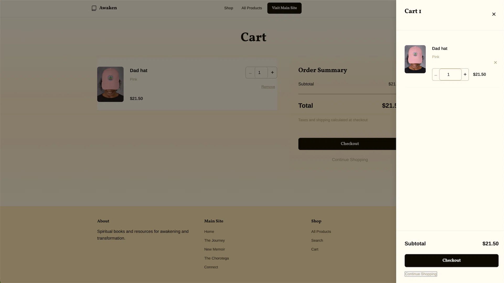
Everything responsive. Everything accessible. Everything bilingual.
The Design Details I Had to Figure Out
Product cards seemed simple until I started building them.
The hover state needed to feel interactive without being distracting. Subtle lift (4px). Gradient overlay that darkens slightly. Image zooms by 5%. Transition duration of 200ms—fast enough to feel instant, slow enough to be smooth.
The “god rays” background effect from the main site needed to animate without causing performance issues. CSS keyframes. Transform and opacity changes. GPU-accelerated. Runs at 60fps even on slower devices.
Typography hierarchy had to work in both English and Spanish. Some Spanish translations are longer. Buttons needed to accommodate that without breaking layouts.
Navigation needed to be simple but complete. Two-tier header: site-wide links at top, collection/product links below. Collapses on mobile into a clean bottom drawer.
None of these details were “required.” All of them were things I had to learn how to implement properly.
What I Learned About Business Value
Here’s what I discovered a custom theme can provide:
Perceived Value
Your products look more expensive because your store looks intentional. Same t-shirt, better presentation, higher perceived value.
Brand Consistency
Customers click from your main site to your shop and it feels connected. No jarring transition. No cognitive dissonance.
Customer Trust
A polished store signals professionalism. People are more comfortable entering payment information when the site doesn’t look thrown together.
Future Flexibility
When you want to add new products, new collections, new features—you’re not fighting against embedded widgets or predefined templates. You can grow.
Better Conversion Rates
Smooth checkout experience. Clear product information. No friction. People complete purchases instead of abandoning carts.
These aren’t abstract benefits. They’re measurable. They affect revenue.
But they only happen if you take the time to learn how to build them properly.
Learning to Work with Printful
Print-on-demand services like Printful are great until you realize how complex their product structures are.
One t-shirt. Five colors. Eight sizes. Forty variants.
Every variant has its own SKU. Its own price. Its own set of images. When someone selects “Forest Green” in “2XL,” the correct image needs to display, the correct price needs to show, and the correct SKU needs to go into the cart.
Shopify handles this with variant selectors. The trick is making those selectors not look like ugly dropdowns.
I styled them as color swatches for colors (visual selection) and size buttons for sizes (clear options). Selected states are obvious. Disabled states are grayed out.
Images update instantly when you pick a color. Price updates instantly when you pick a size. No page refresh. No loading spinner. Just smooth, immediate feedback.
Getting this right took longer than building the entire hero section.
But I learned a lot about how e-commerce actually works.
Learning Shopify’s Bilingual System
The shop isn’t “available in Spanish.” It’s built in Spanish.
Every section. Every button. Every error message. Every piece of microcopy.
Shopify’s locale system handles this cleanly. Two JSON files: en.default.json and es.json. Same keys, different values.
{
  "products": {
    "product": {
      "add_to_cart": "Add to Cart",
      "sold_out": "Sold Out",
      "unavailable": "Unavailable",
      "quantity": "Quantity"
    }
  }
}
The Spanish version has the exact same structure. Just translated strings.
This matters for more than just language. It’s something I had to learn how to implement properly in Shopify.
What I Had to Learn
Building a Shopify theme from scratch means dealing with things you wouldn’t encounter with embedded widgets.
Variant Selection Logic
Printful products have complex option structures. Colors. Sizes. Different prices for different sizes (S-XL at one price, 2XL-4XL at higher prices). Getting images to update correctly with color changes. Getting prices to update correctly with size changes. Making sure out-of-stock variants are disabled but visible.
The solution: inline JavaScript that watches for option changes, queries Shopify’s variant data, updates the DOM immediately. No Section Rendering API calls for every click. Just fast, local state management.
Image Gallery Handling
Each variant can have multiple images. Main product image. Thumbnails. The main image needs to match the selected variant. Thumbnails need to show all available images. Active thumbnail needs visual indication.
The solution: dynamic image switching based on variant featured media. Click a thumbnail, it becomes the main image. Select a color, the main image switches to that color’s featured image. Simple logic, but it has to work perfectly every time.
Navigation Simplification
The original design had too many navigation options. Main site links. Shop links. Footer links. Collection links. Cart. Search. Language picker. Social icons.
The solution: Ruthlessly simplify. Keep only what matters for a shop: products, collections, cart, link back to main site. Everything else is noise.
Responsive Product Layouts
Product images on the left, product details on the right. Works great on desktop. Breaks on mobile. Thumbnails taking too much vertical space. Text getting cramped.
The solution: Grid layouts that adapt. Desktop: 400px image column, remaining space for details. Mobile: full-width image, full-width details below. Thumbnails scroll horizontally on mobile instead of stacking vertically.
Cart Drawer Functionality
AJAX cart is standard in modern e-commerce. But implementing it from scratch means handling edge cases. What happens when you add the same item twice? What if someone changes quantity to zero? What if the cart is empty?
The solution: Custom cart web component. Listens for cart update events. Fetches cart state from Shopify’s Cart API. Updates the drawer automatically. Handles all edge cases gracefully.
None of these were catastrophic problems. All of them were learning opportunities.
The Part Where Learning Continues
The store is live. It works. Products load. Variants update. Cart functions. Checkout completes.
But it’s not “done” because I’m still learning about e-commerce.
We’ll add more products. We’ll see where customers get confused. We’ll optimize based on actual behavior, not assumptions.
The foundation is solid enough. The design is cohesive enough. The code is maintainable enough.
Everything else is more learning.
What I Learned About Shopify Development
Most businesses don’t need a custom Shopify theme. Embedded widgets work fine for testing product-market fit. Generic templates work fine for straightforward inventory.
But if you want to understand how e-commerce platforms actually work—if you want to learn what’s possible—then building a custom theme teaches you things you can’t learn any other way.
The time investment (about 8 hours total for this project) gave me a much deeper understanding of Shopify’s ecosystem. How Liquid templating works. How e-commerce UX actually functions. How to handle complex product variants.
What the Lighthouse Scores Taught Me
One thing I learned quickly: Shopify themes have different performance characteristics than custom-built sites. The Lighthouse scores came back at 97-90-96-92 respectively—not the perfect 100s I’m used to with custom Astro builds.
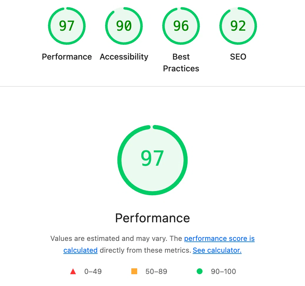
This was actually valuable learning. It showed me that Shopify’s platform has inherent trade-offs. The convenience of their ecosystem comes with some performance overhead. Understanding these nuances is part of learning the platform properly.
It’s a good reminder that I still have a ways to go to learn the nuances of Shopify’s standards and optimization techniques.
The alternative is using pre-built solutions without understanding how they work. Then you’re limited to what others have already built.
I chose to learn.
This Learning Continues
Both the shop and the main site are evolving projects. As Dorian approaches the book launch, we’ll continue adding features, refining the user experience, and adapting to what his audience needs.
New products will be added. Content will expand. The design will grow alongside the journey.
The foundation I built is solid enough to support whatever comes next, and I’ll keep learning as we go.
See it live:
shop.awakentolifeinthemeatsuit.com
Main site:
awakentolifeinthemeatsuit.com
Want something similar?
Let’s talk
Written after finally understanding how Shopify variant selection works, which took longer than I’d like to admit.
Liked this?
Let's build yours
This is how we think about every build. Tell us about yours: a free consultation, a real human, no pressure.