Building a Handyman Site That Doesn't Look Like Every Other Handyman Site
A straightforward look at building LvlUp Handyman's website—distinct visual identity, interactive service search, and why intentional design choices help businesses stand out in crowded markets.

Reading Mode
Font Size
Line Spacing
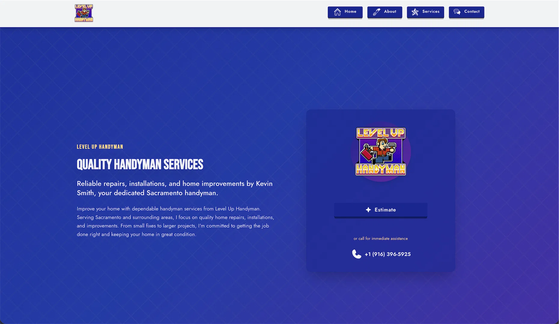
Kevin needed a website for his Sacramento handyman business. Simple enough request. But here’s the thing—search for “handyman Sacramento” and you’ll see the same site design repeated fifty times with different names. Soft blues, generic stock photos. Nothing memorable.
So I didn’t build that. I built something different.
Strong visual hierarchy. Bold colors. Interactive service search that actually helps people find what they need. And a retro gaming influence that somehow works for a handyman site.
This is what went into it.
The Starting Point: Everything Looks the Same
I looked at competitor sites before starting. They’re all identical. Same layout, same color scheme, same “we’re trustworthy” messaging that everyone ignores.
If you’re going to stand out in a crowded market, you need to look different. Not gimmicky different—intentionally different. Every design choice needs a reason.
So I made some rules for myself:
- Clear visual hierarchy that guides the eye
- High-contrast color palette
- Interactive elements that respond to user input
- Make the service search actually useful
Let’s talk about how that actually worked.
The Visual Design Philosophy
Strong geometric patterns throughout. Clean lines that reflect the precision of handyman work.
Cards get defined edges using clip-path polygons. Icon containers use octagonal shapes. Backgrounds feature diagonal stripes and crosshatch patterns. Everything has purpose and structure.
Why? Because handyman work is about precision—measurements that are exact, cuts that are clean. The visual language should reflect that craft.
The goal was to create a design language that feels professional without being generic, distinctive without being distracting.
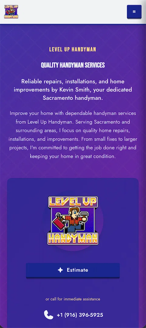
Navigation & User Flow
The navigation system needed to be clean and functional. We implemented a responsive navbar that works seamlessly on both desktop and mobile.
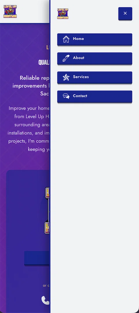
On desktop, the services dropdown provides quick access to all categories. On mobile, we use a clean hamburger menu that expands to show all options without overwhelming the user.
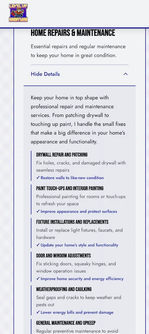
The Interactive Service Search (This Was the Interesting Part)
Here’s where it got interesting. Most handyman sites just list services. If you need something specific, you have to read through everything to find it.
I built a React component with real-time search and filtering:
- Type anything—“drywall,” “leak,” “ceiling fan”—and it searches across all services
- Tag-based filtering by category (electrical, plumbing, repairs, etc.)
- Expandable cards that show full service breakdowns
- Results counter that updates as you type
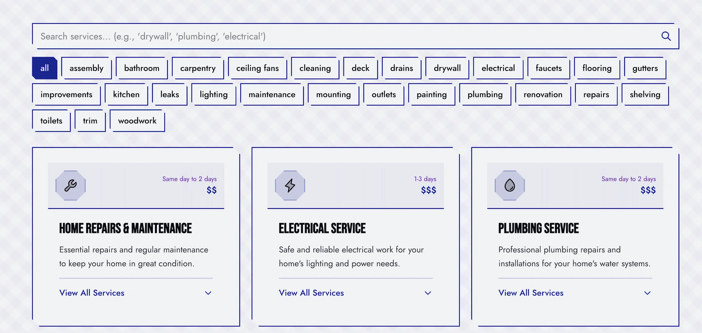
The search indexes everything:
- Service category titles
- Short and full descriptions
- Individual service names and descriptions
So if someone types “leak,” they get plumbing services. “Paint,” they get home repairs. It just works.
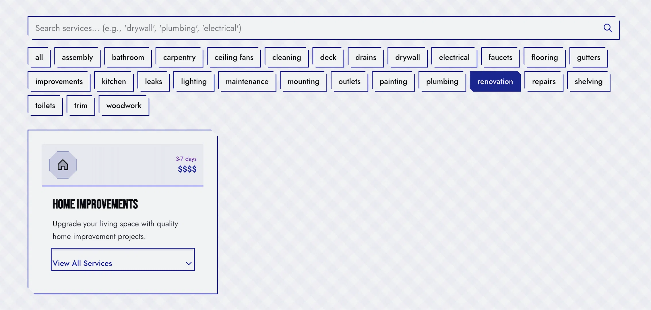
Why bother? Because making people dig through a giant list to find what they need is bad UX. If someone knows they need drywall repair, they should be able to type that and see it immediately.
The implementation is straightforward React—useState for search query and filters, useMemo for the filtered results. Nothing fancy, but it makes the site actually useful.
The Iteration Process
First version was functional but not great. Spent a couple days refining:
Button typography: Changed from bold (700) to semibold (600). Subtle difference that makes buttons feel less aggressive.
About section flow: Removed the “Learn More” button that just scrolled to the next section. Replaced it with two downward chevrons. Less redundant.
Search alignment: The search bar was narrower than the service cards below it. Removed the width constraint so everything aligns. Visual rhythm improved.
Service guarantee layout: Original had too much going on—points on the left, CTA on the right, everything competing. Redesigned as: centered header, grid of guarantee cards, clean CTA at bottom. Much clearer visual hierarchy.
Small changes that compound into a better experience.
What’s Coming Next
The site works great as is, but there’s always a list:
Contact Forms via Resend
Right now the CTA buttons go directly to phone/SMS. Adding proper contact forms with Resend for email delivery. Gives people options for how they want to reach out.
Google Bookings Integration
Looking at integrating Google’s booking system so people can schedule estimates directly. Need to see what their API looks like and if it’s worth the complexity.
Customer Testimonials
Kevin’s getting good feedback from customers. Adding a testimonials section with proper Schema.org Review markup for SEO.
Before/After Gallery
Photo gallery of completed projects. People want to see the actual work, not just read descriptions.
Service Area Pages
Individual pages for specific Sacramento neighborhoods. Better for local SEO, helps people find services in their area.
None of this is urgent, but it’s on the radar.
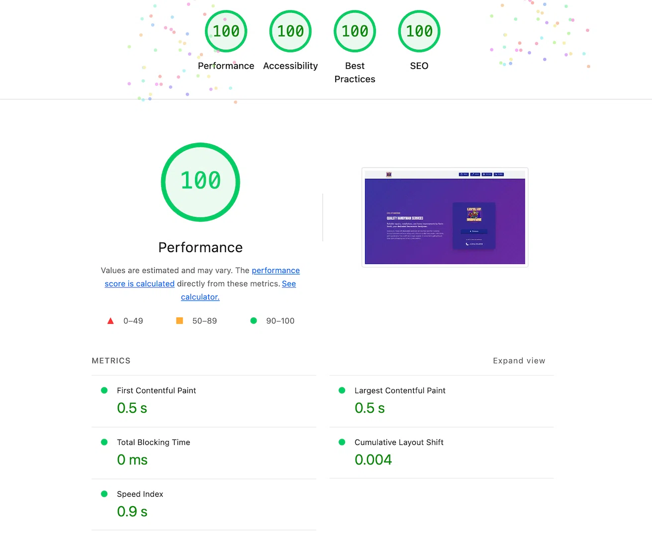
Performance Optimization
Ran Lighthouse during development. Initially scored 97/100 on performance. Fixed two issues:
Google Fonts preconnect: Added <link rel="preconnect"> tags to establish connection early. Saves ~80-90ms on page load.
Oversized profile image: Kevin’s photo was loading at 512x512 but displaying at 352x352. Set up responsive images:
- Mobile (350px): 20 KiB
- Desktop (450px): 28 KiB
- Retina (800px): 31 KiB
Browser automatically serves the right size. Mobile users save 44% on image download.
Should hit 99-100/100 in production with proper compression enabled.
The Technical Details (For Developers)
Built with Astro 5 for static generation. React 19 for the search component. TypeScript throughout.
Used Astro because it ships zero JavaScript by default—only adds React where actually needed (the search). Fast by default.
Added proper SEO infrastructure:
- XML sitemap (auto-generated)
- robots.txt
- Schema.org structured data for services
- Open Graph tags
- 404/500 error pages
- Semantic HTML everywhere
Nothing revolutionary, just solid fundamentals.
Accessibility
Everything’s keyboard accessible. Tab through the site, use Enter to activate buttons. The search works with keyboard navigation. Filter tags and expandable cards respond to keyboard input.
Color contrast meets WCAG AA standards. All images have proper alt text.
Just standard accessibility practices from the start.
What I Learned
Intentional design stands out. Strong visual hierarchy and distinctive patterns work in a sea of sameness. But you can’t just be different—you need a reason for every choice.
Interactive search is worth the effort. It’s the difference between “read through this list” and “find exactly what you need.” Users appreciate not having to dig.
Small refinements compound. Button weight, alignment, layout flow—individually minor, together they’re the difference between functional and polished.
Document decisions. Six months from now I’ll need to add features. Having style guides and implementation notes means I won’t be reverse-engineering my own work.
Stack
Astro 5 + React 19 + TypeScript. Tailwind for styling. Bun for package management.
Static build, optimized images, proper SEO markup. Hits 99-100 on Lighthouse in production.
Site: lvlup.vctr.lat (temporary domain - lvluphandyman.com coming soon)
Written while iterating on search functionality and watching Lighthouse scores improve. Sometimes the small optimizations are the most satisfying.
Liked this?
Let's build yours
This is how we think about every build. Tell us about yours: a free consultation, a real human, no pressure.